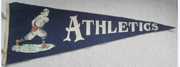
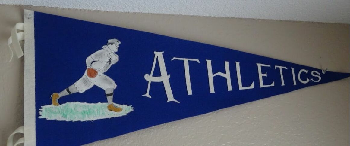
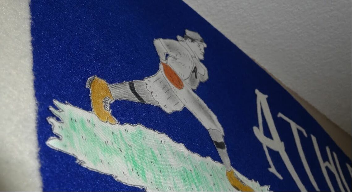
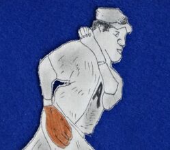
 The designThe earliest painted graphic pennants made for professional baseball teams hit the market around 1910. They were cutting edge at the time, as most pennants of the day were made of sewn letters and sewn emblems. The old style took time and money to make; but this new crop could be produced en masse for a fraction of the cost and time. Additionally, their graphics could be made with greater detail because they were screen printed on with paint--not sewn on in felt or leather. This not only enabled graphic illustrations; but, such artwork could be done in multiple colors. Given the above advantages, you might think that felt novelty makers of the day quickly abandoned the old style in favor of painted graphic designs. But, they didn't. I'm not entirely sure why. Sewn letter designs would remain extremely popular for collegiate and souvenir pennants through the 1930s. But, for whatever reason, professional baseball pennants were made with painted graphics and the majority continued being made this way through the 1960s. The Philadelphia Athletics were one of professional baseball's first dynasties. Lead by manager Connie Mack, the A's captured "World's Series" titles in 1910, 1911 and again in 1913. They were good. That meant that a lot of different manufacturers made pennants for them. The above Athletics pennant has always been one of my favorites. It almost certainly was made during the early 1910s when the Athletics were in the midst of this championship run. The graphic illustration is terrific! Featuring five distinct colors, this pitcher sports, among other period pieces, a pill box hat. Moreover, the pennant was full size at 30" in length. This very pennant featured above went up for auction in 2016; and when the gavel wrapped, the buyer paid $2,278.54 for it. Since my budget was about $10, I knew the only way I'd have one of these on my walls was to make it myself. The job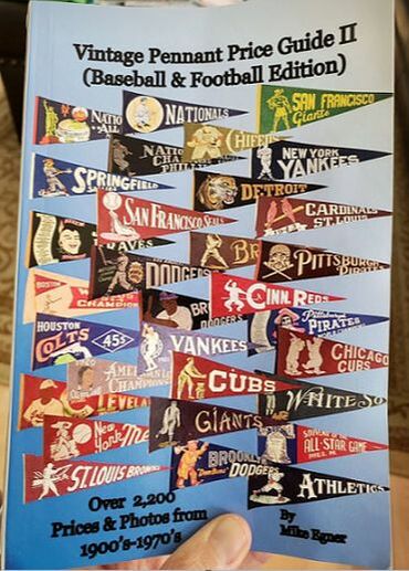 Honestly, this particular project didn't scare me. I had made a Brooklyn Robins pennant that was much similar to this design, and it came out pretty good. The challenge, I thought, would be reproducing the graphic illustration. Unfortunately, when I started this project, I didn't have a good, high resolution image of the original pennant. What I had was a tiny image from the cover of Mike Egner's "Vintage Pennant Price Guide II". (Look for it on the adjacent image, in the bottom right corner.) Nothing as clear (or complete) as the above image.... This complicated things. I knew what the true colors were. I knew what the true dimensions were. And, I had a black and white depiction of the pennant from elsewhere in Egner's book. That's about it. I worked hard to reproduce the image as best I could. Much like my previous re-creations of 1910-era graphic illustrations, my illustration was drawn by me in hand on paper; then transferred to linen. I prefer using linen because it absorbs ink almost as good as paper; and, it absorbs water color okay, which was to be my means of coloring it in. But the challenge was, in fact, reproducing the "ATHLETICS" lettering. That part I underestimated. (This also proved to to be the case on my Brooklyn Robins pennant re-make, posted earlier on this site.) Lettering is really difficult. So much of it has to be drawn by hand, using rulers and vanishing lines and other drafting techniques. This is especially true when the lettering is tapered, as it often appears in vintage pennants. And once you finally draw every letter to your satisfaction--the fun has only just begun. Now you have to cut each letter out. Do this long enough and you'll come to hate certain letters of the alphabet, e.g., "S", "e", and "B", just to name a few of my least favorite. The resultOverall, this job came out pretty good. Not perfect. My letters look fine; but, when compared against the real letters, it's clear mine are too thin. If I had had a bigger, better image of the original pennant when I started, I think my lettering would have been more proportional to the illustration. That's my excuse, anyhow. This just reinforces the lesson I've learned over the several months I've been doing this: To begin with, you have to find a good, high resolution image of the original design. Without this, your design likely won't be 99-100% authentic. I'm still pleased with the result.
  To order a copy of Mike Egner's fabulous "Vintage Pennant Price Guide II", see: www.vintagesportsshoppe.com/priceguides.html . Note: All unquoted material on these pages is © 2019 K.R. Biebesheimer & Son. All rights reserved. Short excerpts may be used after written permission obtained and proper credit is given. ♦♦
0 Comments
|
AuthorIn 2018 I started a separate website called Pennant Fever dedicated to 20th century felt novelty manufacturers. It focuses on these companies' history, products, etc. Eventually, my interest in these businesses inspired me to start making my own pennants. THIS site you're currently viewing, Pennant Factory, is where I'll showcase some of the felt projects I've taken on. Most are reproductions of real pennants once for sale to the public. I've done my best to re-create the originals as authentically as possible based upon surviving photos, known dimensions, etc. Others are my original work, intended to look like the styles of yesteryear. Some turned out better than others. See for yourself. Enjoy! -KRB Projects:
All
Archives
February 2024
|

 RSS Feed
